What’s all the talk about native advertising?
Dan Vaughan from Competitor Group explains native ads and the trend toward real time video.
________________
We were excited to share the Competitor Group POV following OR. That sparked a great conversation internally at Backbone. Below we’ve included our thoughts and an update:
“Native” comes in all shapes and sizes, when done right it is that perfect alignment of advertisers’ and publishers’ message. It should be seamless, and it should not be obvious. The voice between brand and content should be cohesive. We think some of the following examples do this well, and others have a ways to go. It is up to you to decide what is going to be the best fit, and we invite responses and discussion regarding this emerging hot topic.
Backbone Associate Media Director Page Kelley recently put together some links native advertising to spur discussion within the media team. “Native” comes in a lot of shapes and sizes, so these kind of run the gambit. If you have additional comments or questions please feel free to reach out to Page at the link above.
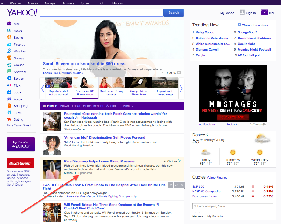
- The Yahoo! homepage recently launched native placements. These placements are designed to look like any other article, but they are shaded in yellow to indicate that they are sponsored.

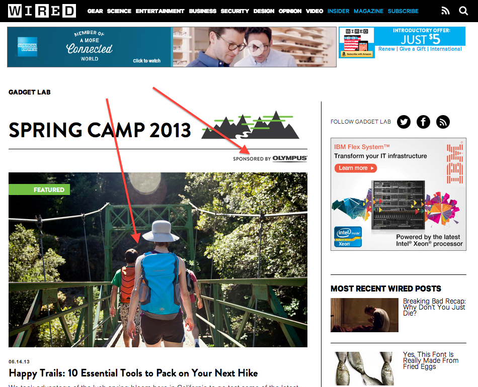
- Wired and Olympus cameras: this example is much more seamless and a less obvious integration. Wired and Olympus partnered on their Spring Camp edit, which featured a variety of different products and content. The catch was, all the photos used in the section were taken with an Olympus camera. The banners within the section are no longer Olympus, but for a program like this, they would typically have 100% share of voice at the time of launch. Their logo remains, as does the subtext below the fold that all photos were taken with Olympus. This is a much more subtle approach to “native”/content integration.

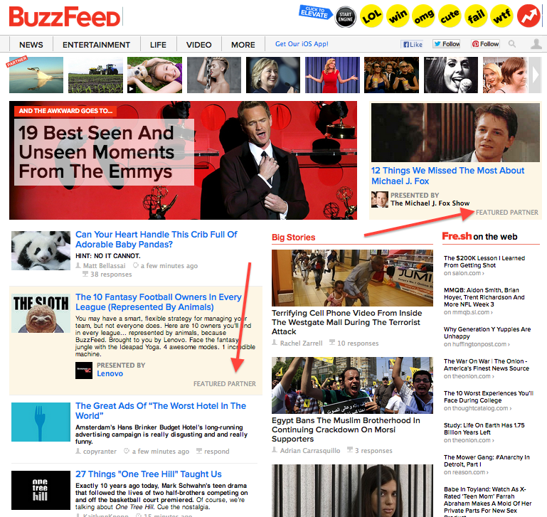
- Buzzfeed: Probably the most widely referenced when it comes to native. Just go to their homepage, and you will find (similar to Yahoo approach), sponsored stories shaded in yellow for brands from Slimfast to Virgin Mobile to Levis. The idea here is for a brand to link themselves to highly shareable content that somehow ties to the messaging and personality they want to communicate. i.e.: Levis and creativity.

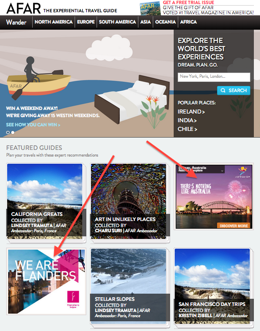
- Afar: This is an example of placement that doesn’t perfectly fit in the definition of “native” as easily as the above cases. This is more about the actual banner placement, rather than the brand contributing to the content on the page. Afar is able to take a standard 300×250 banner, and help it look like a piece of content within their site. When the brand messaging aligns with what readers are already consuming, this can be highly effective. Their homepage layoutis a great example of this tactic.

